")


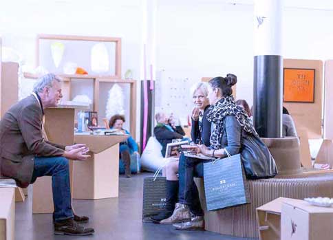
Striking, charming and self-ironic – the line-up of this year’s Creative Paper Conference was as colourful as a candy shop and far away from boring. Likewise, the framework programme with its numerous exhibitors has been interesting, inviting you to get in touch with the different materials as well as with new and old printing and finishing processes – a résumé of two days full of paper magic.
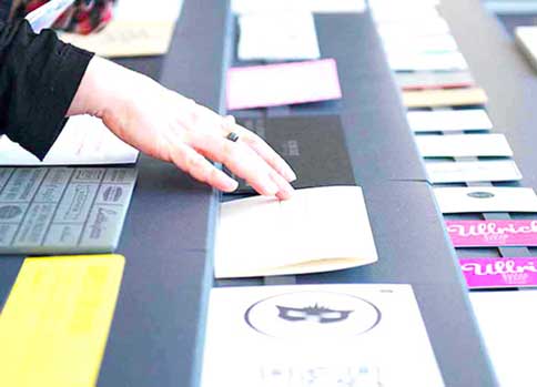
In form of a poster, brochure, card or book and magazine cover, paper has many faces and is able to tell many stories as demonstrated at the Creative Paper Conference. Though each talk covered different paper topics, they all had something in common: Paper is tangible, paper is surprising, playful and above all, it is absolutely emotional. From an early age, people come in contact with paper. They paint on it, they perform handicraft work with it, they cut, fold and glue it.
Katrin Rodegast is doing this still today, yet her version is kind of ‘high-end’. The young illustrator puts a lot of work and concentration into her paper artworks. But the meticulous preparation is all worth it, as her 3D objects, including ‘The White House made from real Dollar notes, have been sported on many known editorials already – from the WIRED magazine to Die Zeit to the New York Times. And guess what, they just cut a fine figure.
Studio Zwölf is not into planning that much, but they truly are about experimenting as mediocrity is no option, and in case they fail, they fail with charm. Other than that, the team is constantly working with extremes, if they can’t be found in the office, they may be shooting bullets on album covers. Apart from that, the studio loves to work with big formats as Stefan Guzy has a crush on posters. The most striking works include a poster that rusts away. A silkscreen made from a colour based on bloody oil (yes, it smells as it sounds). Or a typeface that disappears.
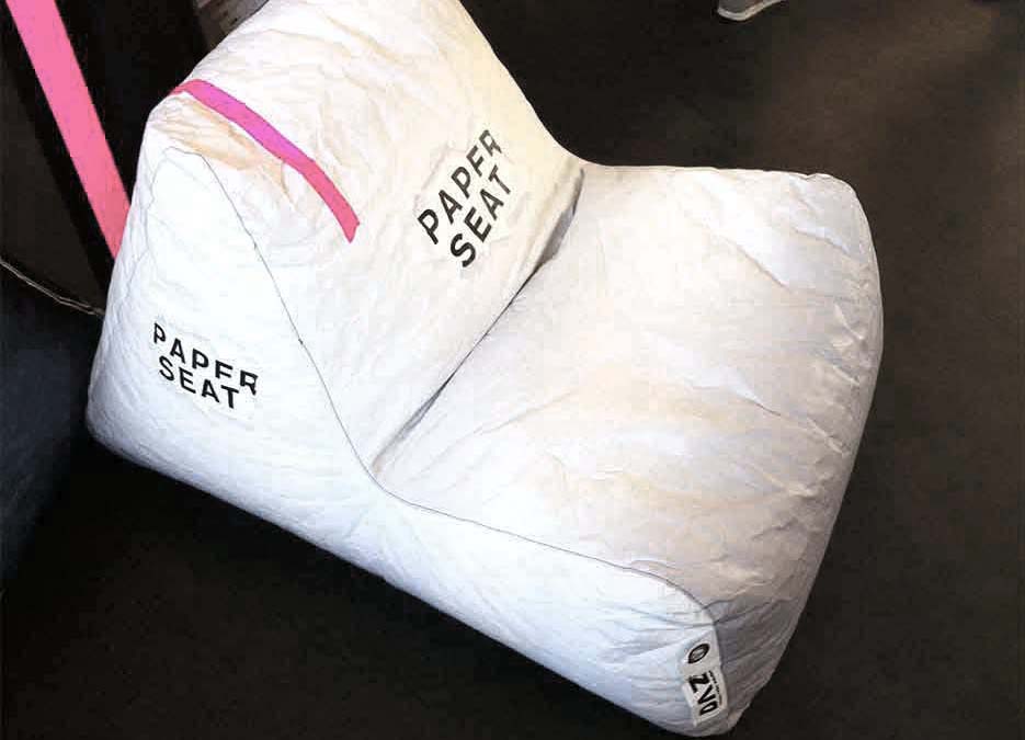
Invisible fonts are not for Langesommer, as typography is in the centre of attention of their work. From Fortesan A to Fortesan B and through the entire benefit catalogue, the different typefaces just bubble out from the young Berlin duo that started working together two years ago to improve many editorials with their ideas, including the current NOVUM cover.
Paper sceneries and set designs – that is the trademark of Atelier für Szenografie. Their work makes them sweat, yet once their paper sceneries are finished, it brings tears of joy to your eyes. Entire shopping malls have been wrapped in their paper designs, and likewise many shop windows have received a ‘paper facelift’. Love for detail and mechanical understanding even set the paper installations in motion.
When it comes to Peter Dahmen, his artwork is all about ‘The Beauty of the Movement’. Thus, unfolding his paper models almost seems magical. However, the idea for his pop-ups was rather born out of necessity. As the only student without a car, he had to come up with a suitable idea to safely transport his 3D objects to college. Irony or destiny that a known car brand has requested him to make a humongous pop-up for their exhibition stand?
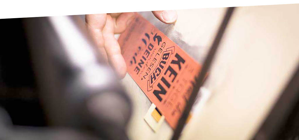
The best has yet to come, that is the motto of Jäger & Jäger. However, the ‘European Design Agency of the Year’ is quite amusing in the here and now already. They like to stretch or over-stretch boundaries from time to time and they definitely enjoy to stand out from the ordinary; one reason why they may celebrate ‘nothingness’, why they produce disinvitations instead of invitations, or why they create brochures about furniture that is literally at the verge of saleability (visualised through furniture that is literally illustrated at the edge of a sheet of paper). Producing anti-promotion or telling people not to buy something, is nothing uncommon too.
The mission of mischen is based on tailored design solutions that are touching and seducing. Having worked on numerous book and Corporate Identity projects for artists, the agency learned to make use of a wide range of paper materials (e.g. paper made from seaweed) and edge colourings to underline the character of the authors. When it comes to the project ‘mindfulness’ from Katrin Micklitz, the design turns into a silent style element. Tone in tone letterpress layouts and subtle colour gradients that are hardly noticed in a single business card.
‘Don’t look so romantic’, that was the headline of KW Neun. The famous quote of the German lyricist Brecht, was used to introduce the Brecht Festival project. In alignment with the poet’s style to write plays, the design of the posters and brochures consisted of contrast and breaking the code. Another daring design concept of Neun comprised the creation of a student index in form of a pantone colour book. Hence, each student profile was complemented with a spot colour. The responsible printer was not amused, but everybody else was delighted.
It is quite stunning, but limitation and constraint provoke the best design solutions according to Büro Rabensteiner. And it is most interesting if you can surprise yourself with your own design. One of these solutions must have been a business card for a photographer that responded to heat as it was finished with a thermo gloss. Other than that, the Austrian studio loves to visit its customers to get to know their spirit. Could happen that they swipe some belongings, their last acquirement…a marmot.
And what did we learn from two days paper magic? The speakers were as special as the material that they were working with. Despite the importance of digital offers, paper is not losing its attraction and remains an expressive means of communication, maybe even more than before. You may keep philosophising, while I have to disinvite you nicely from this text. So, read no further and don’t even think about sharing this content.